- Bootstrapped Growth
- Posts
- 🧑🎨 Visual identities driving >40% more signups
🧑🎨 Visual identities driving >40% more signups
3 Brand Design Tips That Make An Impact
Sponsored by
Hey there,
Welcome back to another edition of Bootstrapped Growth. 👋
Brand design isn’t just about making things ‘look nice’. This week we dive into how strategic visual identities can build trust, communicate value, and boost signup rates.
Table of Contents
Thanks for reading. Let’s jump in!
🚀 3 Design Tips To Boost Conversions
1) Build Emotional Connection With Brand Personality
Figma (collaborative design platform) uses a colorful palette and community-focused visual elements to emphasize their branding around collaboration. The bright, inclusive design language attracts design teams who value creativity and teamwork. Their visual identity reduces the intimidation factor of ‘enterprise software’. Instead, it directly supports Figma’s positioning as an inclusive ‘collaborative design tool’.

Takeaway ➡️ Build a compelling brand personality through visual design to help pre-qualify the right leads before they sign up.
2) Create Trust Signals With Premium Design Language
Stripe makes payments feel trustworthy through clean, minimal design. Their gradient-heavy branding, core 2-3 brand color palette (purples, clean whites) and subtle graphics signal security and reliability. Users convert faster because the visual design reduces perceived risk in financial transactions.
Takeaway ➡️ Build a premium visual identity to signal trust, reliability, and professionalism.
3) Optimize Conversion Through Visual Hierarchy
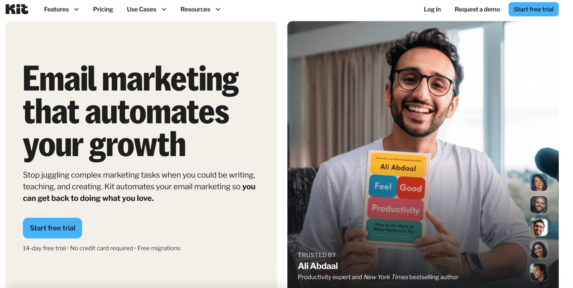
Kit uses strategic color psychology to increase trial conversions by 34%. These choices include blue calls-to-action for positive actions and strategic white space to reduce cognitive load. Their simple visual design makes email marketing feel less intimidating, converting users who want to spend more time on ‘doing what they love’.
Takeaway ➡️ Visual hierarchy guides user behavior during the signup process. Lead users' eyes toward calls-to-action through using color sparingly.
⭐️ Visual Elements That Drive Signups
Color Psychology That Conveys:
Blue - Trust, reliability
Green - Growth, positive action
Purple - Innovation, creativity
Orange - Energy, urgency
Typography Hierarchy:
Headlines should be bold to drive initial interest
Body text must be readable or scannable to reduce bounce rate
CTAs should use contrast to improve click-through rates
Logo Design Impact:
Simple and memorable shapes increase brand recall by 67%
Distinctive elements help with competitive differentiation
🛠 Useful Resources
Find world-class designers and get free examples of high-converting SaaS branding designs with Dribbble.
Become an email marketing GURU.

Join us for the world’s largest FREE & VIRTUAL email marketing conference.
Two full days of email marketing tips & trends, famous keynote speakers (Nicole Kidman!), DJ’s, dance contests & networking opportunities.
Here are the details:
100% Free
25,000+ Marketers
November 6th & 7th
Don’t miss out! Spots are LIMITED!
Thanks for reading and see you next week!
We’d love to hear from you! Simply reply to this email. We want to know what you’d like to see or if you want to get featured with your own marketing example.
👋 Bootstrapped Growth Team